新增表单组件
willian fu 2022 ~
新增表单组件
表单组件开发
wflow 中自带的组件可能并不满足大家的需求,这时候就需要开发自定义组件了,对组件库进行扩充。
组件规范
开发的组件尽量符合统一规范,每个组件都以一个独立的 .vue 文件存在,组件结构定义应如下:
<template>
  <div>
    <div v-if="mode === 'DESIGN'">
      <!--组件在设计器中的样子-->
    </div>
    <div v-else-if="mode === 'PC' && !readonly">
      <!--组件在PC端预览及真实显示的样子-->
    </div>
    <div v-else-if="mode === 'MOBILE' && !readonly">
      <!--组件在移动端预览及真实显示的样子-->
    </div>
    <div v-else>
      <!--组件在流程实例预览中,只读状态下样子-->
    </div>
  </div>
</template>

<script>
//混入配置
import componentMinxins from '../ComponentMinxins'

export default {
  mixins: [componentMinxins],
  name: "组件名称",
  components: {},
  props: {
    placeholder: {
      type: String,
      default: '请输入内容'
    }
  },
  data() {
    return {}
  },
  methods: {}
}
</script>
示例
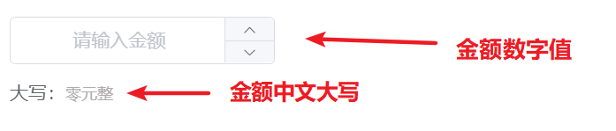
我们以系统自带组件库中的 AmountInput.vue (金额输入框)组件为例
1、定义组件数据结构
打开 /src/views/common/form/ComponentsConfigExport.js,往内添加一项
  {
    title: '金额输入框',
    name: 'AmountInput', //定义组件名称
    icon: 'el-icon-coin',
    value: '',
    valueType: ValueType.number, //金额的值类型为数值
    props: {
      required: false,
      enablePrint: true,
      precision: 1, //数值精度,允许的小数位数
      showChinese: true //是否展示中文大写
    }
  }
2、定义组件
打开 /src/views/common/form/components/ 目录,往内新建一个文件 AmountInput.vue,内容如下
<template>
 <div>
    <div v-if="mode === 'DESIGN'">
      <el-input size="medium" disabled :placeholder="placeholder"/>
      <div style="margin-top: 15px" v-show="showChinese">
        <span>大写:</span>
        <span class="chinese">{{chinese}}</span>
      </div>
    </div>
    <div v-else-if="mode === 'PC' && !readonly">
      <el-input-number style="width: 100%;" :min="0" controls-position="right" :precision="precision" size="medium" clearable v-model="_value" :placeholder="placeholder"/>
      <div v-show="showChinese">
        <span>大写:</span>
        <span class="chinese">{{chinese}}</span>
      </div>
    </div>
    <div v-else-if="mode === 'MOBILE' && !readonly">
      <field readonly clickable v-model="_value" type="number" @click="showKey = true" :placeholder="placeholder"></field>
      <div v-show="showChinese">
        <span style="color:#656363;">大写:</span>
        <span class="chinese">{{chinese}}</span>
      </div>
      <number-keyboard v-model="_value" theme="custom" :extra-key="['00', '.']"
                       close-button-text="完成" :show="showKey" :maxlength="15" @blur="showKey = false"/>
    </div>
    <div v-else>
      {{_value}}
      <span style="margin-left: 30px" v-show="showChinese">
        <span style="color:#656363;">大写:</span>
        <span class="chinese">{{chinese}}</span>
      </span>
    </div>
  </div>
</template>

<script>
//引入Vant UI
import {NumberKeyboard, Field } from 'vant'
import componentMinxins from '../ComponentMinxins'

export default {
  mixins: [componentMinxins],
  name: "AmountInput",
  components: {},
  props: {
    placeholder: {
      type: String,
      default: '请输入金额'
    },
    //是否展示中文大写
    showChinese: {
      type: Boolean,
      default: true
    },
    //数值精度
    precision: {
      type: Number,
      default: 0
    }
  },
  computed:{
    //计算属性绑定金额
    chinese(){
      return this.convertCurrency(this.value)
    },
  },
  data() {
    return {}
  },
  methods: {
    //数字转中文大写金额
    convertCurrency(money) {
        //...省略大写金额转换逻辑
        return '****'
    }
  }
}
</script>

<style scoped>
.chinese{
  color: #afadad;
  font-size: smaller;
}
</style>
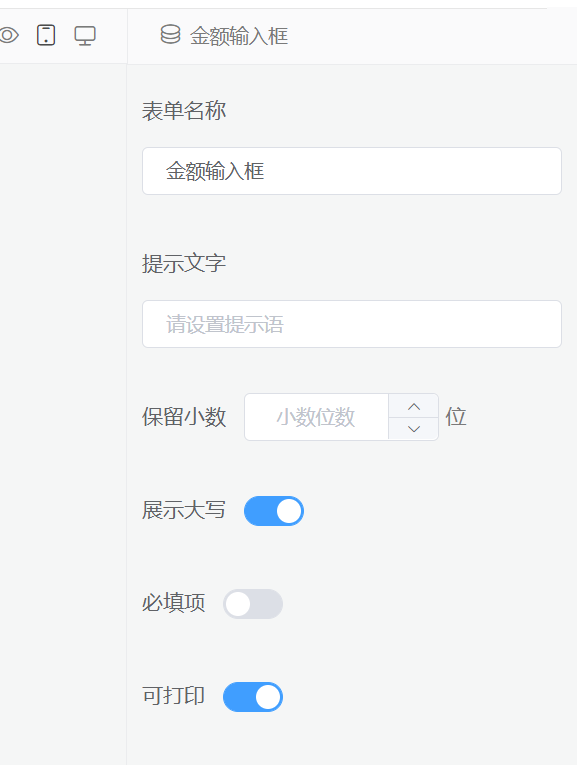
3、定义组件配置面板
每个组件的设置项都有可能不一样,因此为了统一,我们给每个组件都添加一个设置面板
在路径 ``/src/views/common/form/config/目录下, 新建一个AmountInputConfig.vue` 文件
<template>
  <div>
    <el-form-item label="提示文字">
      <el-input size="small" v-model="value.placeholder" placeholder="请设置提示语"/>
    </el-form-item>
    <el-form-item label="保留小数">
      <el-input-number controls-position="right" :precision="0"
                       :max="3" :min="0" size="small"
                       v-model="value.precision"  placeholder="小数位数"/>
       位
    </el-form-item>
    <el-form-item label="展示大写">
      <el-switch v-model="value.showChinese"></el-switch>
    </el-form-item>
  </div>
</template>

<script>
export default {
  name: "AmountInputConfig",
  components: {},
  props:{
    //value为定义组件的数据结构里面的 props 对象
    value:{
      type: Object,
      default: ()=>{
        return {}
      }
    }
  },
  data() {
    return {}
  },
  methods: {}
}
</script>
建议直接使用 el-form-item 组件,方便布局
<el-form-item label="设置项名称">
	<!-- 设置的组件,比如输入框、下拉选择等 -->
</el-form-item>
4、注册组件及配置面板
在 /src/views/common/form/ComponentExport.js 内注册组件,并添加到 export default {} 中导出
在 /src/views/common/form/FormComponentConfig.vue 内注册组件面板
最终效果如下图
组件的开发技巧
与后端接口数据交互
有时候我们可能需要一个从后端获取数据的组件,以上面的金额输入框组件为例
🤐 假设我们需要从后端获取表单提交人账户的可用余额,来限制金额输入框的最大值
此时可以将API请求写在组件的生命周期钩子函数中
<template>
  <!--组件模板-->
</template>
<script>
import componentMinxins from '../ComponentMinxins'
//引入接口
import {getAmount} from '../api'

export default {
  mixins: [componentMinxins],
  name: "组件名称",
  components: {},
  props: {},
  data() {
    return {
        maxLimit: 0
    }
  },
  created(){
      //组件创建完成后加载可用余额
      this.loadAmount()
  },
  methods: {
      loadAmount(){
          //调用api发请求
          getAmount(localStroage.getItem('userId')).then(res => {
              this.maxLimit = res.data
          }).catch(err => {
              //......
          })
      }
  }
}
</script>
组件内引用其他组件
如果组件过于复杂,可以将组件进行多文件拆分,最后用父组件进行渲染
组件动态渲染原理
参见2:[渲染函数 & JSX — Vue.js (vuejs.org)](